

OTI Group Branding Journey
In a world of branding and visual identity, it is not always easy to change what the world has grown to know, not to mention that in some cases such changes could cost millions when it comes to preserving your brand.
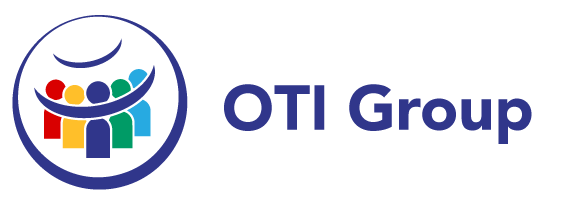
OTI’s logo used to be simple yet complex, coming from the name One Terrene International which means One World International, the old logo had the globe as a main focal point, since it is the world, we aim to preserve and maintain.
When evaluating the logo and more so the globe, it was not quite certain that the message of who we are and what we do is understood simply by looking at the globe. A team of people, board members, partners, people whose lives we have touched, some that just got to know us, and even experts sat down and brainstormed about what we are, what we have done, what we do and most importantly, who we do it for.
We clearly identified that our core is people, even though this planet is a priority, without helping the people first, how can we save the world? But what represents people best? Initially, we looked at the symbol of the Olympic games, a symbol known and understood by everyone as bringing the world together, be it for the sake of sport. Yet, we will need to remain unique in our branding, so 7 circles were not the answer. We know the world is made up of 7 continents so 7 was an important number. In all our goals and objectives, we strive for perfection, and this was something that needed to be seen in our logo as well. Through time, a circle has always represented perfection, an endless loop with no start and no end, continuing indefinitely.
Now that we understood the elements needed, we needed to create one simple, attractive and memorable, cohesive image. We started with a circle, representing the earth, perfection and the unity we believe in. We then added people, or at least symbols representing life and the core values we have; Community, Life, Education, Employment and Environment. Some felt that 5 could represent the different races on our planet, however, different countries and studies identify different numbers of official races, and we identify all races as humans, regardless of colour or beliefs. With 5 symbols in a circle, we were on the right path to something new and exciting, but there was still something missing. We felt the need to add something that embraces all of us, and this is where 2 crescent moons joined the stage, representing land and sea on our planet. With one embracing its people and the other protecting them from above. Now all that was needed was some colour because everyone loves a bit of colour in their lives, yet these colours are not random, they are the colours that represent our core values, and we were done.

The OTI Group Logo defines our values, who we are and what we do, and will be used in different variations for all OTI branded Subsidiaries, as we share the same core values in all our ventures, projects and undertakings.
We hope that this story about our logo journey allows you to get to know us better and helps you identify who you are dealing with when you interact, collaborate, partner with, or receive support from any OTI entity.
Thank you,
Board of Directors
OTI Group